Login
Log in if you have an account
Register
By creating an account with our store, you will be able to move through the checkout process faster, store multiple addresses, view and track your orders in your account, and more.
Create an accountNordic color palettes, how to choose accessory colors
Nordic colour palettes for accessories
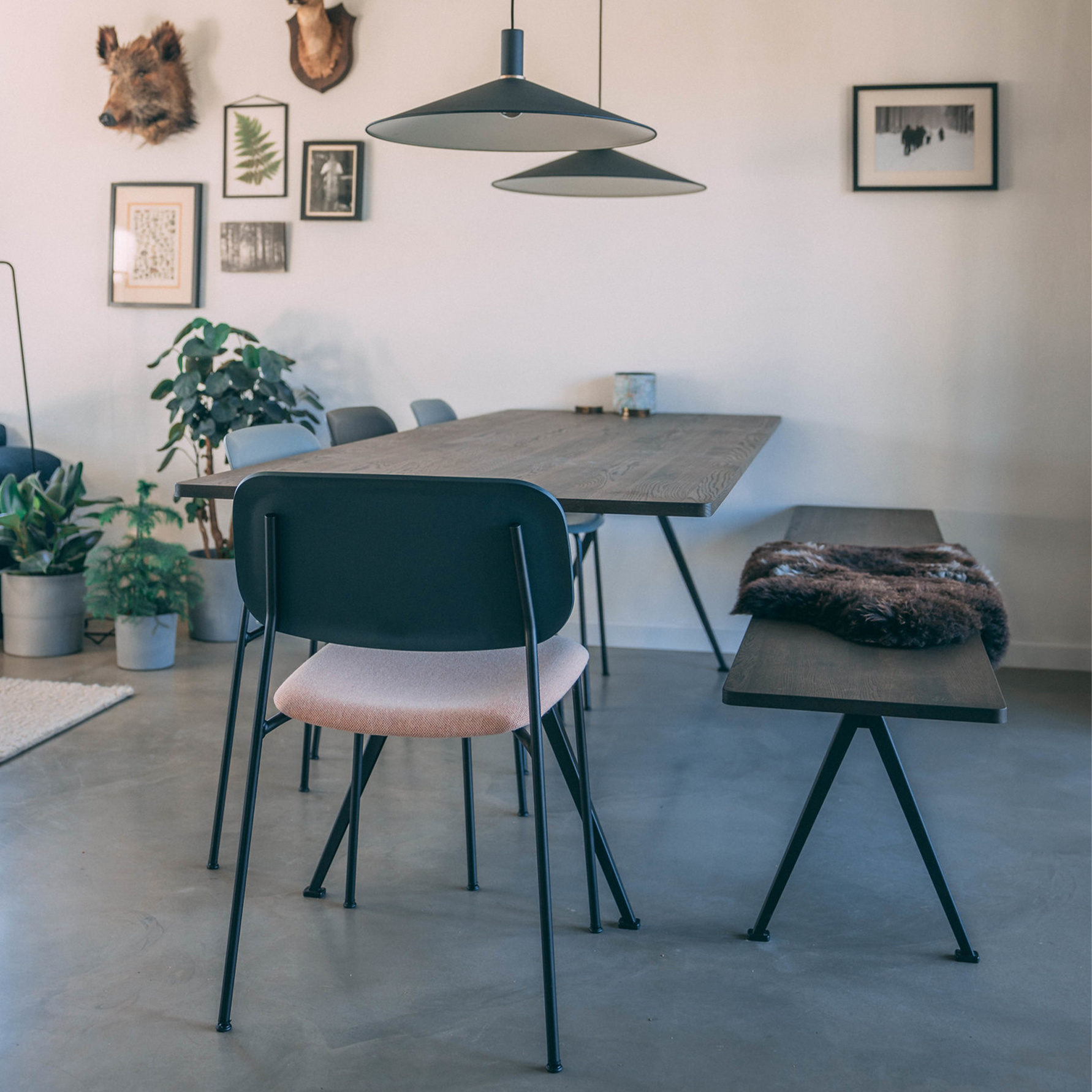
Nordic colour palettes for accessories are all about balance: soft neutrals, natural tones and a few carefully placed accents that make a space feel calm rather than busy. Instead of using many strong colours at once, Scandinavian styling usually starts with off-white, sand, warm grey and wood, then adds subtle depth with black, charcoal, muted green or slate blue. For accessories, that approach works especially well because smaller pieces like vases, cushions, candleholders, lamps and mirrors can shift the mood of a room without overwhelming it.
If you want your home to feel lighter, quieter and more considered, a Nordic palette gives you a practical framework. You do not need to redesign the whole room. A few well-chosen accessories in the right colours can create the clean, warm atmosphere often linked to Scandinavian style and hygge colours.
What are the colours for Nordic design?
The colours for Nordic design are usually rooted in light, nature and restraint. Traditional Nordic colours and modern Scandinavian palettes both favour tones that reflect daylight, soften contrasts and work well with natural materials such as oak, ash, wool, linen and ceramic.
The most common base colours are white, off-white, cream, sand, beige and warm grey. These are often supported by natural wood tones and then finished with darker details in black or charcoal. To stop a room from feeling flat, Nordic interiors often introduce muted accents like dusty sage, slate blue, clay, soft pink or a washed version of navy. The result is not colourful in a loud way, but layered and calm.
For accessories, this matters because colour should support the room rather than dominate it. A vase, cushion or candlestick in a muted tone can add contrast, rhythm and softness while still fitting the Scandinavian look.
How Nordic colour palettes work for accessories
Accessories are where a Nordic colour palette becomes visible in everyday styling. Walls and larger furniture often stay neutral, while smaller objects introduce variation through colour, finish and texture. That makes accessories the easiest place to experiment with Scandinavian colour palettes without losing cohesion.
A Nordic accessory palette usually follows three principles:
- Start with a quiet base of whites, warm greys, sand or beige
- Add natural warmth through wood, stone, linen, wool or smoked glass
- Use one or two accent colours only, preferably muted rather than bright
This is why Nordic colour palettes for accessories feel easy to live with. They are flexible, understated and designed to work across seasons. A warm grey cushion, a muted green vase and a black candleholder can sit together naturally because the palette is controlled from the start.
The core Nordic colour palette for accessories
Soft neutrals as the foundation
Soft neutrals are the backbone of Scandinavian accessories. Think off-white ceramics, sand-coloured textiles, warm grey storage pieces and cream-toned candles. These colours help accessories blend into the room while still adding detail. They are especially useful if you want a calm home that feels curated rather than decorated.
Neutral accessories also make it easier to combine different brands, materials and shapes. A simple arrangement of an off-white vase, a warm grey cushion and a natural wood object already creates a recognisable Nordic mood.
Black and charcoal for contrast
Black is used sparingly in Nordic styling, but it is important. It adds structure and definition to an otherwise soft palette. In accessories, black and charcoal often appear in candleholders, lamp details, frames, organisers or hardware. These darker notes stop a neutral room from feeling washed out and help anchor lighter pieces.
The key is proportion. One or two black accents usually work better than repeating dark tones everywhere.
Muted blue and green for calm depth
Muted blue and green are among the most useful accent colours in Scandinavian style. Slate blue, dusty sage and grey-green feel connected to landscape and light, which makes them ideal for Nordic-inspired accessories. They add colour, but in a quiet way.
These tones work particularly well in glass vases, cushions, candles and small decorative objects. They can cool down a warm neutral scheme or bring subtle freshness to a room that leans beige and wood-heavy.
Clay, taupe and warm earthy notes
Many modern Nordic palettes also include muted earthy tones. Gentle taupes, soft clay and dusty terracotta can make accessories feel warmer and more tactile. Used carefully, these shades give neutral interiors more depth without moving away from Scandinavian simplicity.
Earthy tones are especially effective in textiles, ceramic pieces and table accessories, where their softness feels natural and lived-in.
Popular Nordic colour palettes for accessories
Off-white, sand and natural wood
This is one of the most classic Scandinavian colour palettes. It feels bright, light and timeless. Off-white and sand create a clean base, while natural wood adds warmth and texture. It works beautifully for vases, trays, mirrors, desk organisers and lighting.
- Best for: minimalist spaces, bright rooms, small apartments
- Works well with: linen, oak, paper lamps, matte ceramics
- Mood: calm, airy, understated
Warm grey, charcoal and cream
If you prefer a softer contrast, this palette is a strong choice. Warm grey creates subtle depth, cream keeps the look gentle and charcoal adds graphic definition. It suits accessories with a more architectural or contemporary shape, such as candlesticks, lamps and monochrome textiles.
- Best for: modern Scandinavian interiors
- Works well with: wool, smoked glass, powder-coated metal
- Mood: balanced, refined, modern
Dusty sage, sand and black
This palette brings in a soft natural accent without becoming overtly colourful. Dusty sage sits comfortably with sand and black because all three tones feel grounded. It is ideal if you want a little more personality in accessories while keeping a restrained Nordic look.
- Best for: living rooms, shelving, entry styling
- Works well with: ceramics, textured textiles, green-toned glass
- Mood: calm, organic, fresh
Slate blue, warm white and oak
Slate blue is a useful Scandinavian accent because it feels cool, quiet and timeless. Combined with warm white and oak, it creates a palette that is serene but not cold. This is a good option for accessories in bedrooms, workspaces and reading corners.
- Best for: relaxed and light-filled interiors
- Works well with: wooden lamps, woven baskets, soft cushions
- Mood: restful, clean, composed
Muted clay, taupe and off-white
For a slightly warmer interpretation of Nordic design, muted clay and taupe can replace cooler greys. This palette still feels Scandinavian, but softer and more enveloping. It suits homes where you want the idea of hygge colours to feel visible through warmth and tactility.
- Best for: cosy corners, dining areas, layered styling
- Works well with: stoneware, boucle, linen, walnut accents
- Mood: warm, tactile, grounded
Best accessory types for a Nordic colour palette
Some accessories carry colour especially well because they are easy to move, group and layer. If you want to apply a Nordic colour palette with minimal effort, start with a few of these categories.
Vases and decorative objects
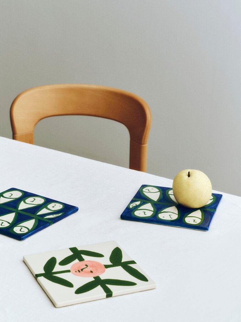
Vases are perfect for introducing muted tones like smoky blue, grey-green, off-white or clay. Because they are sculptural, they add colour and form at the same time. Grouping two or three vases in tonal shades often works better than choosing one very bright statement piece.
Candles and candleholders
Candles support the Nordic atmosphere through both colour and mood. Cream, soft grey, dusty green and muted pink can all work well, especially when paired with simple holders in black, steel, ceramic or glass. This is one of the easiest ways to bring hygge colours into your home.
Cushions and throws
Textiles are ideal for layering Scandinavian colours because they add softness as well as tone. A neutral sofa can be updated with cushions in warm grey, muted blue or earthy taupe without losing its calm look. Try keeping the colours tonal and varying the texture instead.
Lighting accents
Lamps, cord sets and smaller lighting details are useful if you want a more graphic colour note. Black, soft white, muted green and powdery tones often work better than saturated shades. In Nordic styling, the finish matters as much as the colour, so matte, brushed or softly reflective surfaces are usually the safest choice.
Desk organisers, trays and small storage
Practical accessories should still follow the palette. Trays, containers and organisers in soft neutrals or restrained accent colours keep everyday surfaces tidy while reinforcing the room's colour story. This is where what Scandinavian interior design is becomes especially clear: function and aesthetics support each other.
How to choose the right Nordic palette for your room
The best Nordic colour palette for accessories depends on the light, materials and mood of the space. Instead of asking which palette is most stylish, ask which one supports what is already there.
If your room is bright and minimal
Use warm whites, sand, pale greys and light wood. Add only a small amount of black or charcoal for definition. This keeps the room airy and aligns with the classic Scandinavian look.
If your room feels cool or flat
Introduce warmer tones like taupe, clay, cream and oak. These colours make the space feel softer and more inviting without becoming heavy.
If you want a subtle accent colour
Choose one muted accent only, such as dusty sage or slate blue, and repeat it in two or three accessories. That creates continuity and avoids a scattered result.
If you mix styles at home
Nordic palettes work surprisingly well in non-Scandinavian interiors. In a more industrial room, use warm grey, black and oak to soften harder surfaces. In a bohemian setting, muted clay, sage and off-white can calm the mix of textures and patterns. In a contemporary home, charcoal with warm neutrals keeps accessories clean and architectural.
Simple rules for styling Scandinavian accessories by colour
- Choose one base colour family and build around it
- Limit yourself to one or two accent colours
- Repeat a colour at least twice for a more cohesive look
- Mix texture more than colour to keep the scheme calm
- Use black as a detail, not as the dominant tone
- Let natural materials soften cooler shades
- Prefer muted colour over bright contrast for a more Nordic result
Nordic accessory palette ideas at a glance
| Palette | Main colours | Best accessories | Effect |
|---|---|---|---|
| Classic light Nordic | Off-white, sand, wood | Vases, trays, mirrors, lamps | Bright and timeless |
| Soft contrast Nordic | Warm grey, cream, charcoal | Candleholders, organisers, textiles | Refined and modern |
| Nature-inspired Nordic | Dusty sage, sand, black | Glassware, ceramics, cushions | Fresh and grounded |
| Quiet blue Nordic | Slate blue, warm white, oak | Lamps, throws, vases | Calm and restful |
| Warm hygge Nordic | Muted clay, taupe, off-white | Candles, textiles, table decor | Cosy and soft |
FAQ about Nordic colour palettes for accessories
What is the colour palette for Scandinavian style?
The colour palette for Scandinavian style usually combines white, off-white, beige, sand, warm grey and natural wood with restrained accents in black, muted blue or muted green. The goal is to create light, calm and balance rather than strong contrast.
What are the traditional Nordic colors?
Traditional Nordic colors often include white, grey, blue, green, earthy reds and natural wood tones. In modern interiors, the most common versions are softer and more muted, especially for accessories and home decor.
What are hygge colors?
Hygge colours are warm, soft and comforting shades that make a room feel cosy. Think cream, taupe, warm grey, muted clay, dusty rose, soft brown and candlelight-inspired tones. In Nordic accessories, these colours work well in textiles, ceramics and candles.
Can Scandinavian accessories include colour, or should they stay neutral?
Scandinavian accessories can absolutely include colour, but it is usually muted and controlled. Rather than using many bright tones, Nordic styling tends to rely on one accent colour at a time, supported by a neutral base.
How many colours should I use in a Nordic accessory palette?
In most cases, three is enough: one main neutral, one supporting neutral and one accent colour. You can add black or charcoal as a detail if the room needs more contrast.
Which Nordic colour palette is best for small spaces?
Light palettes with off-white, sand, pale grey and light wood usually work best in small spaces because they keep the room feeling open. If you want contrast, add it through a few black details rather than large dark accessories.
How do I stop Nordic accessories from looking too cold?
Bring in warmth through texture and undertone. Choose warm whites instead of stark whites, add oak or ash, and include wool, linen, ceramic or smoked glass. A palette with taupe, clay or muted green can also soften the overall effect.
At Espoo, Nordic colour palettes for accessories are less about strict rules and more about creating a home that feels calm, useful and well balanced. By starting with soft neutrals and introducing colour in a restrained way, you can build a Scandinavian look that feels timeless and personal at once. For a broader foundation, see our guide to Scandinavian interior design principles, or explore Scandinavian home accessories for ideas you can apply directly. If you want more practical buying guidance, read how to choose home accessories.
Recent articles
View allComing soon...
Interior design service