Login
Log in if you have an account
Register
By creating an account with our store, you will be able to move through the checkout process faster, store multiple addresses, view and track your orders in your account, and more.
Create an accountScandinavian colors explained
Scandinavian Colour Palette
A well-balanced Scandinavian colour palette makes a room feel brighter, calmer and more intentional. Instead of relying on stark white alone, the best Scandinavian interiors use layered neutrals, muted earthy tones, soft blues and greens, and a few darker accents to create warmth without visual noise. If you want a home that feels light, functional and inviting, this colour direction is one of the easiest to live with and one of the hardest to get right without a clear plan.
In this guide, you will find what defines a true Scandinavian colour scheme, which colours work best together, how to use them in different rooms, and how to bring the look together with wood, textiles and lighting. You will also see how a Scandinavian style color palette can feel classic, modern or slightly more expressive while still staying true to the Nordic design approach.
What defines a Scandinavian colour palette?
A Scandinavian colour palette is built around light, balance and comfort. Its purpose is not just aesthetic. In Nordic interiors, colour helps reflect natural light, soften long dark seasons and create a sense of calm in everyday living. That is why the palette usually starts with quiet base tones and adds depth through texture, material and small contrasts rather than loud colour blocking.
The typical foundation includes off-white, soft white, warm greige, pale beige, light taupe and gentle grey. These shades are then paired with natural materials such as oak, ash, wool, linen and matte ceramics. Accent colours are often understated rather than bright: dusty blue, sage green, muted terracotta, clay, charcoal or a softened black. The result is a room that feels clean but never cold.
This is also why the terms Scandinavian colour palette, colour palette Scandinavian, Scandinavian colour scheme and Scandinavian style color palette are often used interchangeably. They all refer to a restrained, natural and functional use of colour where every tone supports the atmosphere of the space.
What are the Scandinavian colors?
The Scandinavian colors are usually a mix of soft neutrals and muted nature-inspired tones. While many people think only of white and grey, the real palette is broader and more layered.
- Soft whites - for walls, ceilings and light reflection
- Warm greige and taupe - to make minimal spaces feel softer
- Pale beige and sand - for warmth without heaviness
- Light grey - to add calm structure
- Dusty blue - a classic Nordic accent with an airy feel
- Sage and muted green - linked to forests, moss and natural balance
- Terracotta and clay - used carefully to add warmth and depth
- Charcoal and soft black - for contrast in lighting, frames and details
The key is not using all of these at once. Scandinavian interiors usually stay within a narrow range of two or three main tones, then add one accent colour in a very controlled way.
Why this colour direction works so well in interiors
A Scandinavian colour scheme is popular because it solves several design problems at once. It makes small rooms feel larger, helps darker spaces feel brighter and creates a calm backdrop for everyday living. It also gives you flexibility. A soft neutral base can be paired with classic wood furniture, modern lighting, textured textiles or sculptural pieces without feeling busy.
Another reason it works is longevity. Trend-led palettes can look dated quickly, but muted Scandinavian tones tend to age well because they are rooted in natural light and natural materials. If you want an interior that feels considered now and still works a few years from today, this approach offers much more staying power than stronger decorative colour trends.
Core colours in a Scandinavian style color palette
White and off-white
White is still an important part of Scandinavian interiors, but it is rarely a harsh brilliant white. Softer whites with a warm or chalky undertone are easier to live with and feel less clinical. They reflect daylight beautifully and give wood, textiles and furniture cleaner definition. In a Scandinavian setting, white often works best when balanced with tactile materials such as boucle, linen, wool and light oak.
Greige, taupe and warm neutrals
Warm neutrals are what make a modern Scandinavian colour palette feel comfortable rather than cold. Greige, mushroom, sand and light taupe are especially useful in homes that need softness and depth without moving into obvious colour. These tones work well on larger surfaces such as walls, rugs and sofas, and they pair naturally with oak, ash and brushed metal finishes.
Grey used with restraint
Grey still has a place, especially in contemporary Nordic interiors, but it works best when it has warmth or softness. Flat, icy grey can quickly make a room feel lifeless. A better choice is a nuanced grey that sits between stone and greige. Use it as a secondary tone rather than making it the only colour story in the room.
Muted blues and greens
Soft blue and green shades bring in a clear Nordic feeling because they connect so naturally to sky, water, pine and moss. Dusty blue can lift a bedroom or reading corner, while sage and grey-green bring subtle colour into living spaces without overpowering the room. These shades work especially well in textiles, painted details and smaller upholstered furniture.
Earthy accents and dark contrast
Terracotta, rust, clay and muted cinnamon are increasingly common in updated Scandinavian interiors, especially when paired with warm woods and tactile fabrics. Dark accents also matter. Soft black, charcoal and deep brown give the palette structure. Without some contrast, a pale room can feel unfinished. The Scandinavian approach is to keep these darker tones selective and purposeful.
How to build a balanced Scandinavian colour scheme
A practical way to build your palette is to think in layers instead of isolated colours. Start with one dominant tone for the largest surfaces, add one or two supporting tones, then finish with a small amount of contrast.
- Choose your base colour for walls and the largest visual areas. This is usually off-white, greige, sand or soft beige.
- Add a secondary tone through upholstery, rugs, curtains or painted furniture. Think pale grey, taupe, dusty blue or sage.
- Use a restrained accent colour in smaller objects such as cushions, ceramics, artwork or a lounge chair.
- Anchor the whole palette with material contrast like oak, walnut, wool, linen, paper shades or black metal details.
If you want a simple rule, a 60-30-10 distribution still works well in Scandinavian interiors: 60% base tone, 30% supporting colour, 10% accent. The difference is that in Nordic spaces the visual warmth often comes more from texture and material than from bright accent colour.
Scandinavian colour palette combinations that work
Warm minimal
- Soft off-white
- Greige
- Light oak
- Charcoal details
This combination suits modern apartments and open-plan spaces where you want a calm, timeless look.
Airy Nordic blue
- Chalky white
- Dusty blue
- Pale grey
- Natural ash wood
Ideal for bedrooms, reading corners and interiors where you want a fresh but still soft feeling.
Nature-led neutral
- Warm beige
- Sage green
- Stone grey
- Oak and linen
A great fit for homes that want a stronger link to natural materials and a slightly more organic atmosphere.
Soft contrast
- Warm white
- Taupe
- Muted terracotta
- Soft black accents
This is useful if you like Scandinavian calm but want a little more depth and personality.
What is the traditional Swedish color palette?
The traditional Swedish color palette is lighter and more delicate than many people expect. Historically, Swedish interiors often featured muted whites, pale greys and powdery tones such as soft blue, dusty green and faded pink. These colours were used to brighten interiors and create an elegant sense of lightness, especially in homes influenced by Gustavian design.
In modern terms, the Swedish approach still feels airy and refined. If you want to bring that mood into your own home, think painted surfaces in chalky whites and greys, natural timber, linen textures and a few faded pastel accents rather than stronger saturated colours. It is a softer interpretation of the broader Scandinavian colour palette, and it works especially well in bedrooms, dining rooms and calm living spaces.
What are the traditional Nordic colors?
The traditional Nordic colors come from climate, landscape and available materials. Across Scandinavian interiors, that often means:
- Snowy white and soft cream inspired by winter light
- Stone and mist greys that reflect rock, sky and coastal weather
- Forest and moss greens linked to pine landscapes
- Muted blues drawn from sea, lakes and northern skies
- Earth reds and clay tones used more selectively for warmth
- Dark contrasting tones inspired by iron, shadow and timber
These colours are not usually used in high saturation. The traditional Nordic approach softens them, making the palette feel livable, natural and visually quiet.
What is Scandinavian color theory?
Scandinavian color theory is less about strict theory in the academic sense and more about Scandinavian interior design principles. The main idea is that colour should support light, function and wellbeing. Instead of filling a room with many competing shades, a Scandinavian style color palette uses a limited set of colours with close tonal relationships. This creates harmony and makes materials stand out more clearly.
Three principles define the approach:
- Light first - colours should help a room feel open and bright
- Tonal harmony - shades should sit comfortably together instead of competing
- Contrast with purpose - darker details are added in controlled ways to create shape and focus
In practice, that means a Scandinavian colour palette often feels calm because the contrast level is carefully managed. The room gets interest from wood grain, woven fabric, matte finishes and sculptural furniture as much as from colour itself.
How to use a Scandinavian colour palette in each room
Living room
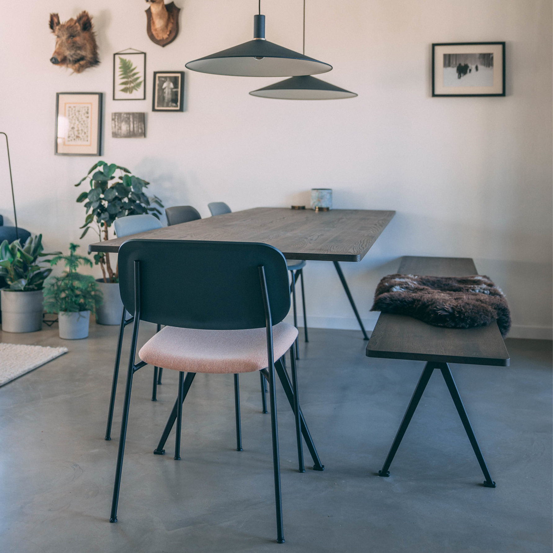
Start with a warm neutral base on the walls and larger furniture pieces. A sofa in greige, sand or soft taupe works well, especially if you layer it with cushions in dusty blue, olive or rust. Add texture through wool rugs, linen curtains and wood tables to avoid a flat look. If you want a stronger focal point, let one armchair, lamp or artwork carry the deeper accent.
Bedroom
Bedrooms suit the softer side of the palette. Off-white, light grey, muted blue and pale green all work well here. Choose bedding in tonal layers rather than sharp contrast, and keep black accents minimal. This room benefits from a palette that feels gentle from morning to evening light.
Kitchen
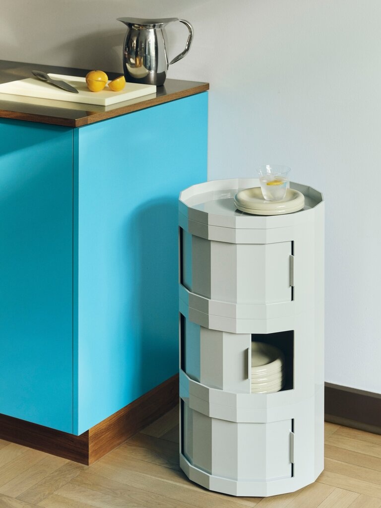
For kitchens, a Scandinavian colour scheme often combines warm white or light greige cabinetry with oak, ash or stone surfaces. If you want colour, muted green and soft blue are strong options for lower cabinets, tiles or accessories. Keep the palette clean and practical, with only one standout colour note.
Home office
A Scandinavian-inspired home office should feel focused but not sterile. Light neutrals help the room stay bright, while sage, stone or muted blue can add enough character to separate the work zone from the rest of the home. Pair the palette with clean-lined furniture and warm lighting so the space remains productive and comfortable.
How to combine colour with materials and furniture
Scandinavian interiors never rely on paint colour alone. The palette only works fully when materials support it. Light wood brings warmth. Linen and wool soften the room. Matte ceramic, smoked glass and brushed metal add depth without unnecessary shine. This is why the same wall colour can feel flat in one room and rich in another.
At Espoo, this approach makes sense because Scandinavian interior design, lighting and textiles are meant to work as part of a full interior composition. A calm base palette can be strengthened with a sofa in a warm neutral fabric, a light wood table, or lighting that adds softness after sunset. Pieces from brands such as Muuto, HAY, Artek, ferm Living and Kvadrat fit naturally into this kind of layered Nordic colour story.
If you are styling a living space, home office or a more refined corporate setting, think of the colour palette as the framework and the furniture as the way the palette becomes tactile and lived-in.
Mistakes to avoid with a colour palette Scandinavian look
- Using only cold white and grey, which can make the room feel clinical
- Adding too many accent colours, which breaks the calm Nordic rhythm
- Ignoring undertones, especially when mixing whites, beiges and woods
- Forgetting contrast, leaving the room washed out and undefined
- Relying on colour without enough texture, which makes minimal interiors feel flat
- Choosing decorative pieces that are louder than the palette itself
FAQ
Can a Scandinavian colour palette include bold colours?
Yes, but in moderation. A Scandinavian palette can include terracotta, deep blue, moss green or even mustard, as long as the overall base remains calm and the bold shade is used selectively.
Is white necessary in a Scandinavian style interior?
No. White is common, but it is not mandatory. Warm beige, greige, taupe and soft stone shades can create a more comfortable and equally Scandinavian feel.
What is the best Scandinavian colour palette for a small room?
Use a light base such as off-white or pale greige, add one soft secondary tone like sage or dusty blue, and keep contrast details minimal but clear. This helps the room feel open without becoming bland.
How many colours should a Scandinavian room have?
In most cases, two to three main colours plus one restrained accent is enough. The rest of the depth should come from texture, wood tones and lighting.
Does a Scandinavian colour scheme work with darker furniture?
Yes. Darker furniture can work very well when the room has a light base and enough warm texture around it. The contrast can make the space feel more grounded and modern.
Can I use a Scandinavian style color palette outside the living room?
Absolutely. It works well in bedrooms, kitchens, home offices and even more professional interiors because the palette is calm, flexible and easy to combine with natural materials.
If you want to translate a Scandinavian colour palette into real furniture, lighting and textile choices, Espoo brings together curated Nordic design collections and showroom inspiration in Antwerp and Turnhout, alongside online guidance for creating a calm, balanced interior, including ideas for Scandinavian home accessories, Scandinavian sofa colours and current Scandinavian interior design trends.
Recent articles
View allComing soon...
Interior design service