
Login
Log in if you have an account
Register
By creating an account with our store, you will be able to move through the checkout process faster, store multiple addresses, view and track your orders in your account, and more.
Create an accountThree color palettes for Scandinavian interiors
Scandinavian Colour Palettes
Scandinavian colour palettes are known for making interiors feel lighter, calmer and more balanced. At their best, they combine soft neutrals with carefully chosen accents, so a room feels warm and lived-in rather than flat or clinical. If you want to create a timeless Nordic look, the key is not using more colour, but using colour with more intention.
A Scandinavian palette usually starts with a quiet base and then builds depth through contrast, texture and a few restrained accent tones. That is why this style works so well in both modern homes and more classic interiors: it is flexible, easy to live with and visually cohesive.
What defines a Scandinavian colour palette?
The foundation is usually light, muted and natural. White, off-white, soft grey, beige, taupe and warm greige are common starting points because they reflect light well and create a calm backdrop for furniture, lighting and textiles.
But Scandinavian colour palettes are not limited to neutrals. A well-balanced scheme often includes one or two supporting colours such as dusty blue, sage green, muted pink, terracotta, charcoal or deep navy. These tones add character without disturbing the overall sense of simplicity.
What makes the palette feel Scandinavian is the balance between:
- Lightness - colours that help a space feel open and bright
- Soft contrast - enough variation to avoid a washed-out look
- Natural warmth - tones that work with wood, textiles and everyday living
- Restraint - fewer colours, used more deliberately
The core colours used in Scandi style
Soft whites and off-whites
White remains one of the most recognisable Scandinavian colours because it enhances daylight and gives rooms a clean, uncluttered base. In practice, softer whites often work better than stark brilliant white, especially when you want the result to feel warm and inviting rather than sharp.
Greys, greige and muted beige
These colours add subtle depth while keeping the room understated. Grey brings a cooler, architectural feel, while beige and greige make the palette softer and more relaxed. They are especially useful when you want a neutral room that still feels layered.
Earthy and nature-led tones
Sage, olive, stone, clay and moss-inspired shades connect the palette to the natural world, which is a strong part of Nordic design language. Used sparingly, they bring warmth and calm without dominating the space.
Dusty blues and deeper cool tones
Blue is one of the most effective Scandinavian accent colours. Pale blue can feel airy and restful, while deeper blue or blue-grey adds contrast and sophistication. These tones pair particularly well with pale wood, wool textures and simple silhouettes.
Charcoal, black and dark accents
Dark tones are often used in smaller amounts to ground the palette. A black lamp, charcoal textile or darker statement piece can sharpen a soft neutral scheme and stop it from feeling too uniform.
Three reliable Scandinavian colour palette directions
1. Light and airy
This is the classic Nordic approach. It uses soft white, warm off-white, pale grey and light wood tones to create a room that feels bright, clean and spacious.
- Best for: smaller rooms, low-light spaces, calm minimal interiors
- Typical colours: off-white, light grey, cream, pale oak tones
- Accent options: black details, soft blue, sand or taupe
2. Warm neutral and earthy
This version feels softer and more grounded. It keeps the Scandinavian restraint but introduces warmer undertones through beige, taupe, clay and muted green.
- Best for: living rooms, cosy bedrooms, homes that need more warmth
- Typical colours: greige, taupe, sage, clay, warm white
- Accent options: terracotta, moss, charcoal, natural textiles
3. Cool and refined
This palette is more tonal and slightly moodier, while still feeling calm. It combines white or pale neutral bases with cooler greys, dusty blue and deeper green or navy accents.
- Best for: modern interiors, architectural spaces, more defined contrast
- Typical colours: cool white, stone grey, blue-grey, deep blue, dark green
- Accent options: black, pale putty, brushed metal, soft wool textures
How to build a Scandinavian palette that feels balanced
Start with one dominant base colour, then add a supporting colour and a smaller accent. A simple way to think about it is:
- 60% base tone for walls or the largest surfaces
- 30% secondary tone for larger furniture, rugs or textiles
- 10% accent colour for lighting, cushions, accessories or one darker piece
This prevents every colour from competing equally for attention. It also makes it easier to keep the room cohesive, which is essential in Scandinavian interiors.
When choosing colours, look at them together with the elements that shape the room most visibly: furniture, lighting, curtains, rugs and smaller home accessories. In Scandinavian interiors, colour is rarely isolated. It works as part of the whole composition.
How light changes Scandinavian colours
One reason Scandinavian palettes rely so heavily on soft neutrals is that light changes everything. A colour that looks calm and warm in one room can feel cooler or flatter in another depending on daylight, orientation and the amount of shadow in the space.
If a room gets limited natural light, warmer whites, soft beige and gentle greige often feel more inviting than crisp cool tones. In brighter rooms, cooler greys, dusty blues and clearer whites can look fresh without becoming harsh. This is why Scandinavian colors explained in more detail often starts with how tones respond to light: they stay comfortable throughout the day.
Applying Scandinavian colour palettes in real interiors
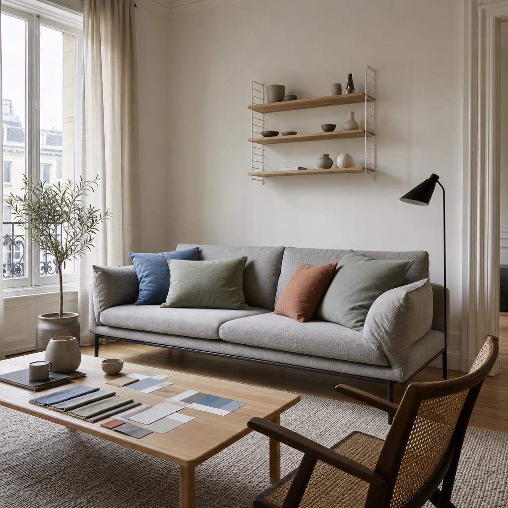
The most successful Nordic interiors do not rely on paint alone. The palette comes to life through the combination of surfaces and objects in the room. A soft wall colour, a well-chosen sofa, textured textiles, simple lighting and a few accessories in related tones create much more depth than colour on its own.
If you are shaping a room around a Scandinavian palette, it helps to think in layers:
- Walls: keep the base quiet and light
- Furniture: use form and upholstery colour to introduce the second tone
- Lighting: add contrast and sculptural definition
- Textiles: soften the scheme and repeat accent tones
- Accessories: use sparingly to reinforce the palette rather than clutter it
That approach makes the result feel curated and timeless, which is central to the principles of Scandinavian interior design for everyday living.
FAQ
What is the colour palette for Scandinavian style?
A Scandinavian colour palette usually combines light neutrals such as white, off-white, grey, beige or greige with restrained accent colours like dusty blue, sage green, terracotta, charcoal or deep navy. The overall effect is calm, bright and balanced.
What colours are used in Scandi style?
The most common colours in Scandi style are soft whites, warm neutrals, muted greys and nature-inspired tones. Darker accents such as black, charcoal or deep blue are often added in smaller amounts to create contrast.
What are the Scandinavian colours?
There is no single fixed list, but Scandinavian colours are typically understated and easy to live with. Think white, cream, grey, taupe, sage, dusty blue, clay and darker grounding tones used with restraint.
What is the traditional Swedish colour palette?
A traditional Swedish palette often leans lighter and softer, with whites, pale greys and gentle pastel-influenced tones such as muted blue, soft green or powdery pink. It tends to feel airy, elegant and reflective of natural light.
If you want to translate a Scandinavian colour palette into a complete interior, it helps to look beyond paint and consider how furniture, lighting, textiles and accessories work together. Espoo combines curated Scandinavian design with personal guidance, helping you turn a colour direction into a coherent room that feels calm, functional and timeless. For readers exploring related Nordic color palettes or current Scandinavian interior design trends, this broader view can make styling decisions much easier.
Recent articles
View all
Coming soon...
Interior design service